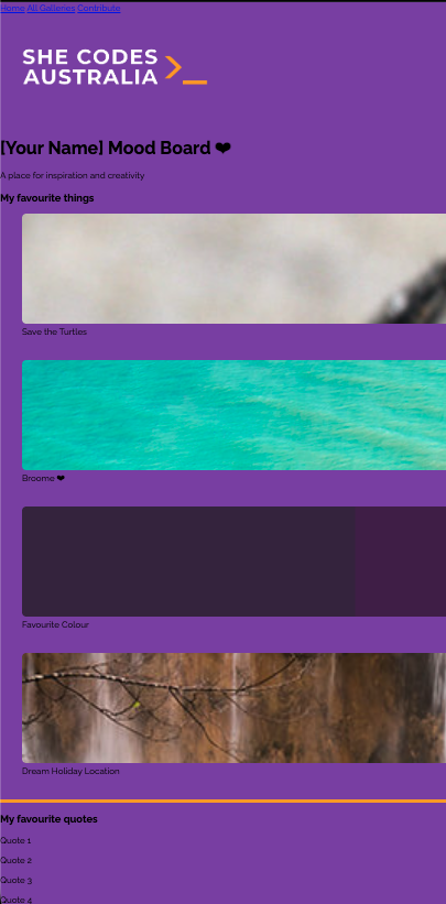
Sizing
The images on our page are all enormous, so let’s start by learning how to specify element sizes.
Step 1
Add the following to your CSS:
/* Your CSS here */
img {
	height: 200px;
}
The tag selector will get every img element.
The height property changes the height of an element by whatever value you provide - in this case, we’ve specified 100 pixels (px).
Test
Every image on the page should now have the same height.
Every image now has the same height, but if we have a look at our preview of the final product, we can see images of different sizes:

Instead of changing the height of all images at once, let’s start at the top of the page and, working our way from top to bottom, resize each group of images.
Step 2
If we take a look at the HTML, we can see that the first image is in the header.
Instead of setting the height of every image to 200px, let’s only set the height of the header image.
To do this, we can combine the header and image selectors, like so:
Before - Replace this code
/* Your CSS here */
img {
	height: 200px;
}
After - Updated code
/* Your CSS here */
header img {
	height: 200px;
}
We read this like: “select all the img tags that are in the header tag.
Test
Only the first image will be 200px in height, and the rest will return to their default sizes.
Step 3
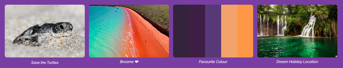
The next couple of images are a bit different. They all have rounded edges and have captions describing them. Notice how they’re also aligned next to each other.
Let’s take a look at the HTML to see the structure of this part of the page:
<section class="row" id="favourite_things">
	<h3>My favourite things</h3>
	<div class = "grid-container"> <!-- Your images goes under here -->
		<figure class="grid-item"> <!-- Your first image -->
			<a href="https://en.wikipedia.org/wiki/Turtle" target="_blank">
				<img src="https://assets.codepen.io/5804361/turtle_2.jpg" alt="A baby turtle on the beach" />
			</a>
			<figcaption>Save the Turtles</figcaption>
		</figure>

		<figure class="grid-item"> <!-- Your second image -->
			<img src="https://images.ctfassets.net/0zg5jftjwixq/2wqI4cgOUXecvmBiQ2v7pi/8f8f2a4ec1bca634ea15f587593f4ee7/NEW-Broome-Coast-WA-122782-56.jpg?w=1600" alt="We love Broome" />
			<figcaption>Broome ❤</figcaption>
		</figure>

		<figure class="grid-item">
			<img src="https://www.color-hex.com/palettes/8143.png" />
			<figcaption>Favourite Colour</figcaption>
		</figure>

		<figure class="grid-item">
			<img src="https://www.wildplanetblog.com/img/croatia-df4a3205.jpg" alt="Plitvice National Park Waterfalls" />
			<figcaption>Dream Holiday Location</figcaption>
		</figure>
		<!-- You can add more images to your grid view of images by repeating the process above -->
	</div>
</section>
Notice how these white boxes are all the same height?
Let’s add some CSS for this.
From the HTML above, we can see that each box is in a div with the class grid-item.
Add a height to each of these images:
After - Adding to this code
.grid-item {
	height: 250px;
}
Before - Change this code code
.grid-item {
	height: 250px;
}
After - Updated code
.grid-item {
	height: 250px;
}
.grid-item img {
	height: 200px; /* Fixed height for a uniform grid */
}
The images in the cards should now all be the same height.
The way we set the height of these images is a bit different to what we did previously.
Rather than specifying a value in pixels, we gave a percentage.
This CSS is saying “set the height of this element to be 40% of the height of its parent (where parent means the element it is in, in this case, that is the card).
Step 4
So far we have just been setting the height, but we can actually set the width using the same format. Let’s modify our CSS to also set the width of the cards and their images.
Before - Update this code
.grid-item {
	height: 250px;
}
.grid-item img {
	height: 200px; /* Fixed height for a uniform grid */
}
After - Updated code
.grid-item {
	height: 250px;
}
.grid-item img {
  width: 100%;
  height: 200px; /* Fixed height for a uniform grid */%;
}
Note
Our cards aren’t side by side like they are in the preview - don’t worry! We’ll get to that soon!
Optional
If you’d like your images to have rounded corners, add the following code!
.grid-item {
	height: 250px;
}
.grid-item img {
	width: 100%;
	height: 200px; /* Fixed height for a uniform grid */;
	border-radius: 8px;
}
Step 5
The last section is favourite_quotes and has multiple boxes with quotes (a reference to your work in part 3.1!.
Let’s take a look at the structure of the HTML:
<section class="row" id="favourite_quotes">
	<div id = "quotetile">
		<p>“Creativity takes courage.”</p>
	</div>
	<div class="first-row" id="box-1">
		<p>Box 1</p>
	</div>
	<div class="first-row" id="box-2">
		<p>Box 2</p>
	</div>
	<div class="second-row" id="box-3">
		<p>Box 3</p>
	</div>
	<div class="second-row" id="box-4">
		<p>Box 4</p>
	</div>
</section>
Each of these images is in a Set the div with the classes first-row and second-row.
Eventually, these columns will be side by side.
Challenge!
width of the divs with the first-row and second-row classes to 250px.
We will then resize the images inside these columns.
Here’s what your page should look like at this stage: